Draw Your Infrastructure
Last month, we introduced our new host view that gives users the flexibility to group and filter their hosts based on tags.
Today, we’re excited to announce a complementary view: the host map! The host map allows intuitive assessment of infrastructure health so you can group, filter, and “color” hosts based on tags and metrics you care about. If you want to glance over your infrastructure and visually identify outlier hosts quickly, then the new host map will serve you well.
Using the Host Map
Accessing the Host Map
The new host map is accessible via the host view. You’ll see a link called “View Host Map” at the bottom of the page.
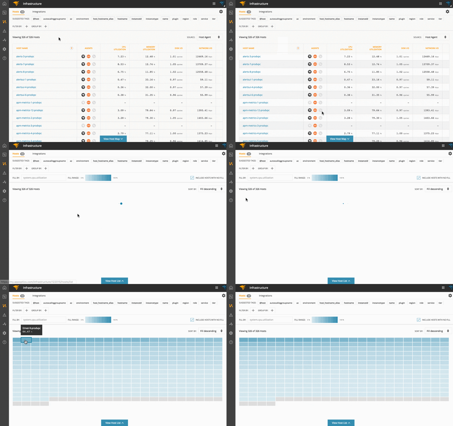
Once you access the host map, you’ll see a default view showing all the hosts sorted by CPU utilization, based on data gathered by the AppOptics™ Host Agent. This allows you to quickly identify hosts that are running hot by just looking at the individual host’s gradient color (darker means higher utilization).
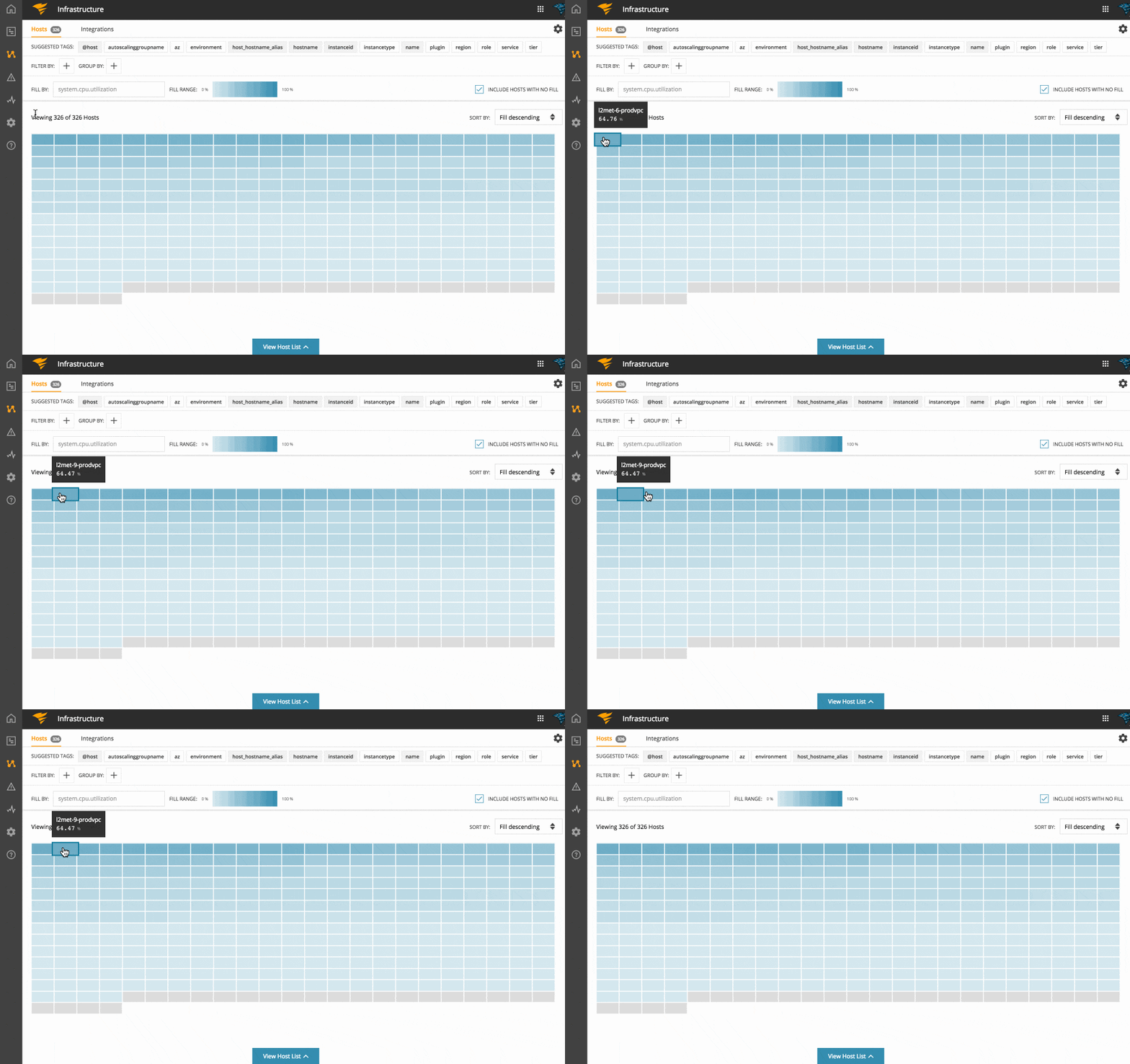
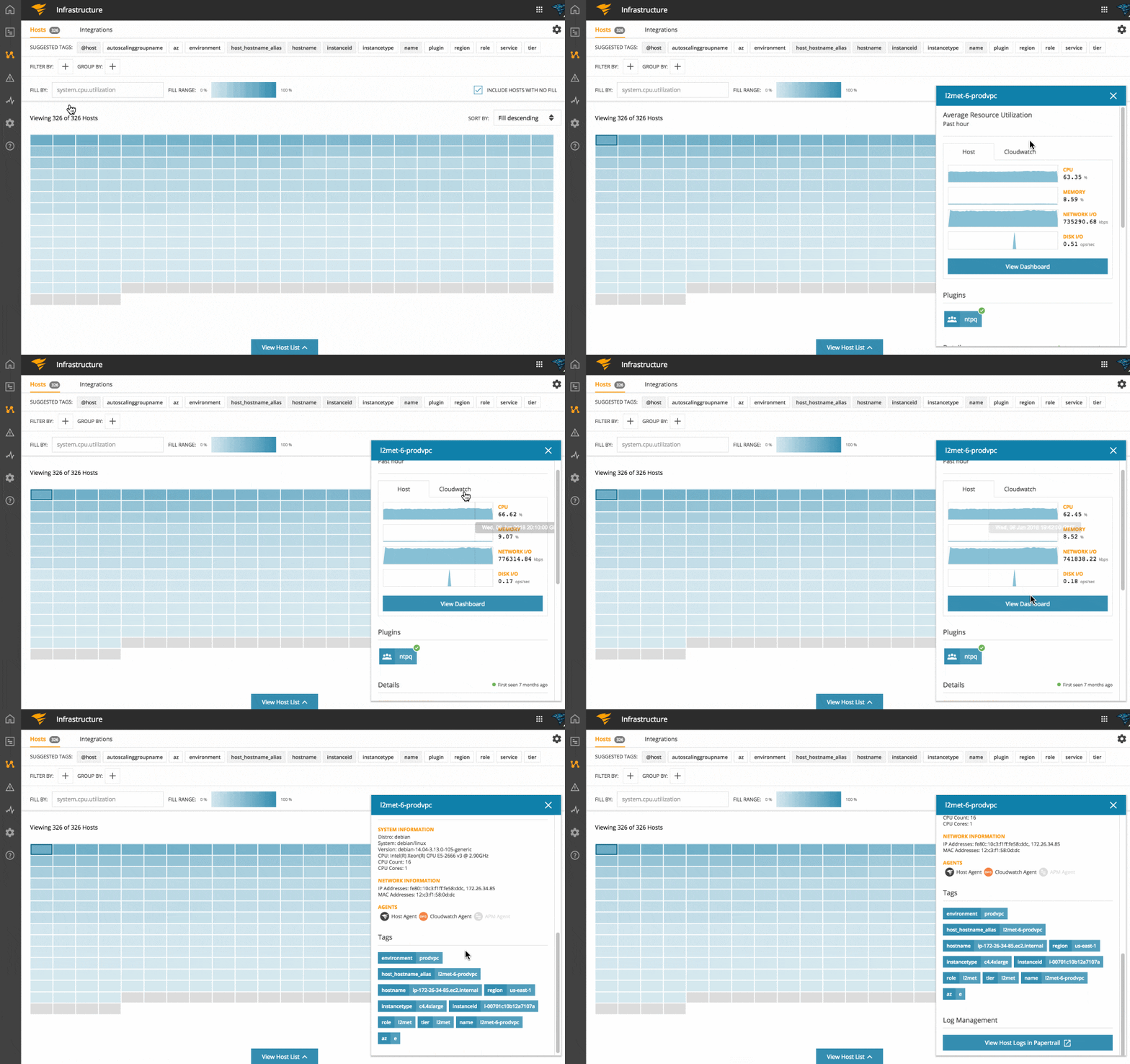
Click on an individual host to open up the host card, which contains detailed information about the host, like system info, network info, KPIs, plugins, services, and tags.
Visualize Hosts by any Metric
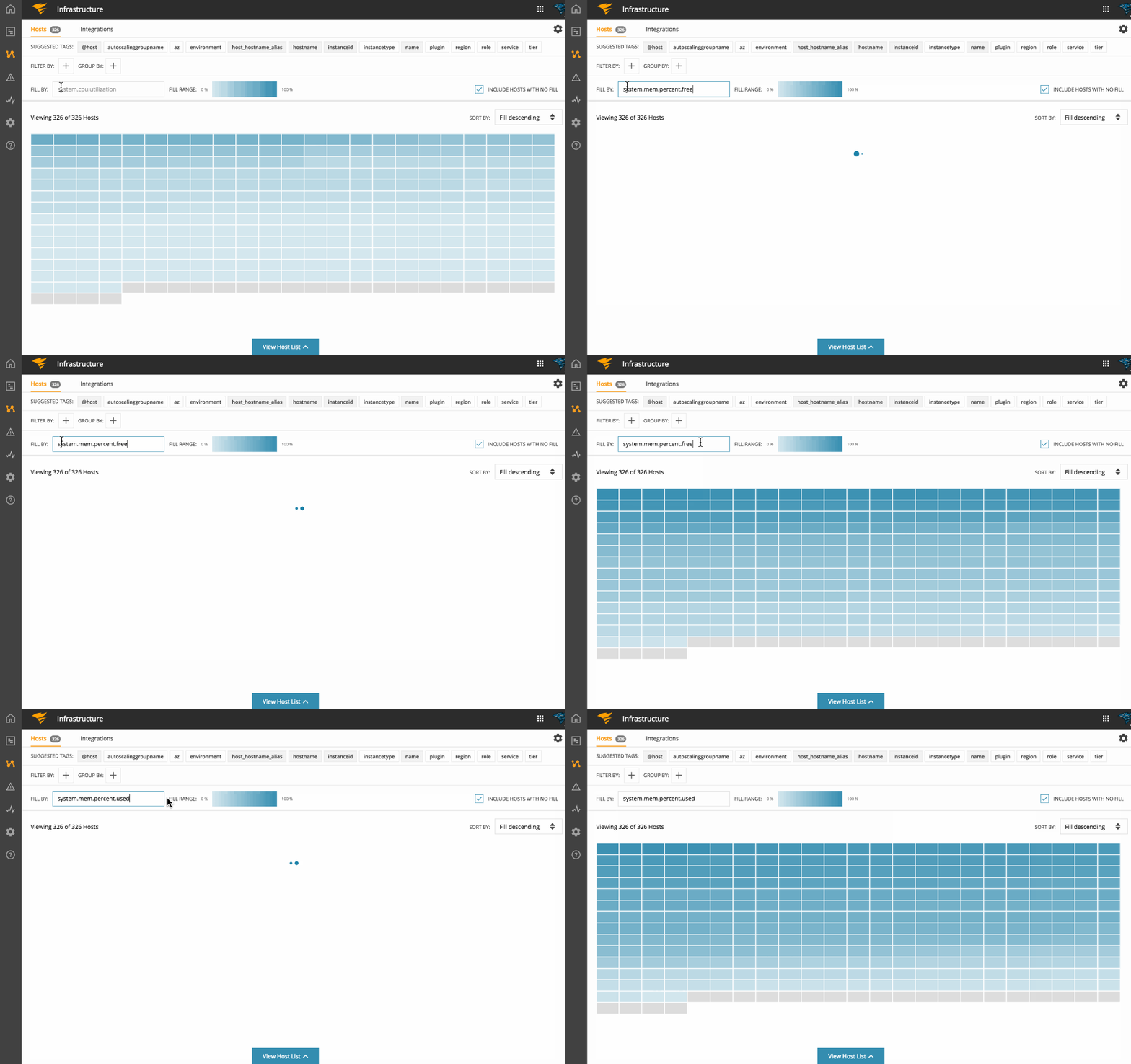
One key difference between the host list and host map is that you can color by any host-tagged metric you want.
You may not always want to see your hosts based on CPU utilization. For example, you may want to see your hosts based on memory utilization, disk, or network I/O.
The host map provides an easy way to accomplish this. You can select any metric via the “Fill By” input to color your hosts.
Grouping and Filtering Hosts
We applied the same grouping and filtering capability available on the host list to the host map.
This means that you can apply up to three tags for grouping your hosts, in addition to any filters narrowing the focus.
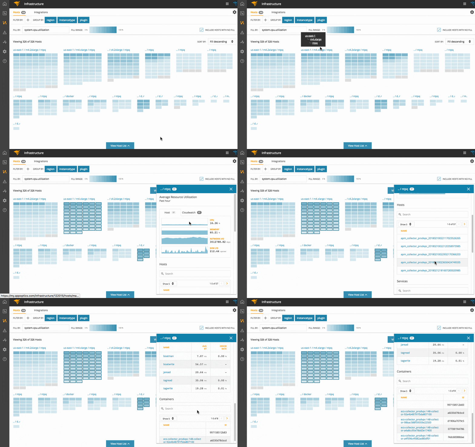
The host map below shows hosts grouped by region, instancetype, and plugin tags, respectively.

The host list obeys the same group and filter settings, and you can toggle back and forth as needed.
Identifying Hosts that Belong to the Same Group
When you group hosts using multiple tags, it logically results in nested groups. For simplicity, the resulting groups are flattened and presented as distinct, individual groups.
As you can see on the diagram below, every permutation of the region, instancetype, and plugin is presented as an individual group.

When you hover over the group label, a tooltip containing a hierarchical structure of the grouping is displayed. You can click on any group on the shown hierarchy and the host map will select all hosts that fall under that group.
Conclusion
Whether you want to quickly find metric hot spots across your infrastructure or see relative infrastructure provisioning and utilization, the host map has you covered.
The best way to experience the host map is to actually use it. Go ahead and give it a try! We’re already building the next extension of the host map, but if you have any feedback, don’t hesitate to drop us a line.
Happy mapping!
