

 Note: This article was originally published on Librato, which has since been merged with SolarWinds®AppOptics™. Learn about monitoring application performance with AppOptics.
Defying the Ravages of Data Consolidation Functions
Metrics can be deceptively large. They’re normally composed of disarmingly innocuous little date/value tuples, which seem unlikely to strain the storage device of even a respectable smartphone much less a grandiose server.
They add up though. Every one of those little metrics, stored as a float, measured every five seconds, and persisted for a year—takes up around 50MB of space. Multiplied by thousands of metrics on hundreds of machines, this modest storage conundrum is a tricky problem; it’s one that informed the design of the automatically consolidating, ring-buffer based time-series data stores most of us use today.
In this article, we’ll explore the inner workings of techniques commonly used to compress data inside these data stores. Some of them can be quite destructive to the quality of your data in unintuitive ways, so it is important to know as much as possible about how they work, and what ramifications they might have on the accuracy of the measurements you’ve worked so hard to collect.
Understanding the Consolidation Function
The data stores that are designed to store time-series data this way begin with a fundamental observation, namely, the older the data is, the less fidelity we require of it. If this is true, it means we don’t need to store the data in it’s native resolution forever. Instead, we can keep the native measurements for a short time, and consolidate the older data points to form a compressed set of samples that adequately summarize the dataset as a whole.
This compression is usually accomplished using a series of increasingly drastic automated data consolidations. You can think of the data store itself as a series of time buckets. High-resolution, short-term buckets are very large. They can keep a bunch of data points in them, but longer-term buckets are smaller. As the data comes in, it’s passed from bucket to bucket on a set interval; first into the now bucket, then into the five seconds ago bucket and so on. Eventually, when the data points reach the 24-hours ago bucket, they’ll find that it’s too small to fit them all. So they need to elect a representative to continue on for them and therefore, a means of carrying out this election must be chosen.
When you use a data store that performs automatic data summarization, you’ll commonly need to configure a storage layout like the one laid out above. This one, for example, stores raw measurements for the first 24 hours, then one consolidated datapoint for each hour for the next two weeks, and then one data point for every five hours , for 6 months, etc. This summarization is a critically important piece of every time series database. In a practical sense, it’s what makes storing time series data possible.
Every database that does automatic data summarization allows you to control the method it uses to consolidate the individual data points into summarized data points. Usually called the “summarization function” or “consolidation function”, this is the means by which the data points will decide who keeps going when the buckets get too small. You often need to configure this when you first create the data store and, once set, it cannot be changed.
Pre-selecting a data consolidation function that is subsequently set in stone for the life of a metric is problematic and dangerous, because your choice has a dramatic impact on the quality of your stored measurements over time. Worse, computing the arithmetic mean (AM) of all the data points in a period is by far the most commonly used (and usually the default) consolidation function, which is a terribly destructive means of aggregating individual measurements.
Averages Produce Below-Average Results
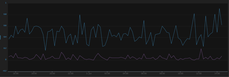
Using AM in this context is bad for two reasons. First, averages are horribly lossy. In the instrument below for example, we’ve plotted the same data twice. The blue line is the raw plot, while the green line is a five-minute average of the same data.


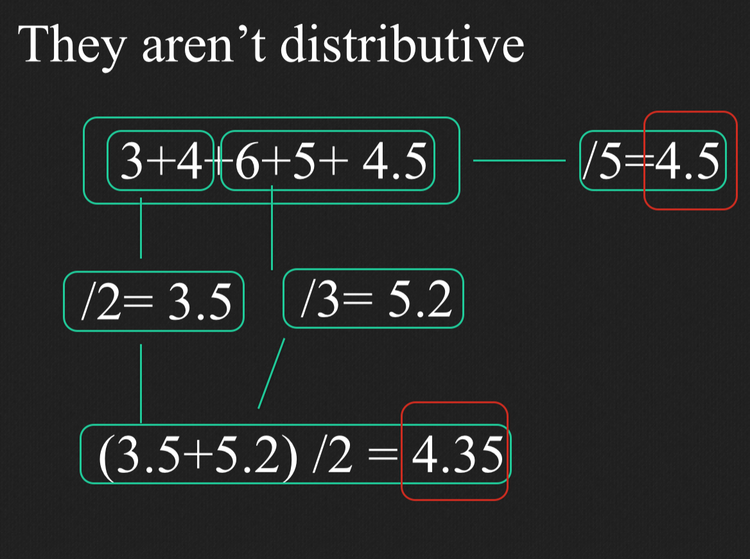
Second, averages are not distributive. This is to say, you start to get mathematically incorrect answers when you take the average of already-averaged data (as shown below). Both of these effects are detrimental in the context of systems monitoring, because they have a tendency to smooth the data, when those peaks and valleys are what we’re really interested in.

Every time you create an archive set to AVERAGE inside a typical automatically-consolidating ring-buffer DB, or fail to modify the default storage schema and allow such an archive to be created for you automatically by some middleware, you’re employing AM to consolidate your data points over time. When you employ these DB’s, the AM effects corrupt your data whenever you scale a graph outside the native-resolution window, or call a function that includes already-consolidated data.
Even if your native-resolution window is 24 hours and your graph is displaying 24.01 hours, the entire dataset you’re looking at is averaged. If your raw-window is 24 hours, and you’re calling a function to compare last weeks data to this weeks data, both sets have been averaged.
If your native resolution window is 24 hours, and you’re pulling a weeks worth of data through a re-summarization function to depict your metric at a different rate (like foos per day), then you’re looking at the average of already-averaged data. In this case, your measurements have been once averaged by the automatic consolidation inside the DB, and then again by the function to re-summarize it at a different scale. What you end up seeing in this case is very likely to be mathematically incorrect.
To be sure, there are situations when using the arithmetic mean is the best all around option. However, generally if we fully understand the storage layer and think about what we’re measuring on a per-metric basis before we commit to a consolidation function, the alternatives become much more attractive.
If, for example, we’re measuring 90th percentile per-request latency, we probably want to keep the largest data point in each time interval. This way, we preserve an accurate representation of the maximum latency our users experienced in that hour, day, or week. For cases like this, the older the data gets, the more irrelevant the average becomes (and more relevant the max). The difference is evident in the following graph of 90th percentile request duration, where the average is sometimes as much as two orders of magnitude smaller than the max for a one-hour interval.


Many of our day-to-day metrics are incrementing counters; +1’s, that add up to individual values that we don’t actually care about, because we’re really interested in the rate that they represent. In this case, we don’t need to know the value of these metrics (their value is always ‘1’), we only need to know how many of them there are. For these, a consolidation function that just counts the number of measurements in each interval is analogous to lossless data compression.
Combining these two use cases implies a different way of thinking about metrics storage. If we could keep both the Maximum 90th percentile per-request latency, as well as a running count of the number of measurements submitted in each interval, we could derive both latency and rate information from this single metric. The latency information would equate to the metric value and tell us how slow our thing was, while the number of measurements would be equal to the rate of requests, which would tell us how often users were asking for our thing.
Spread-Data For The Win
At Librato, we’ve used Cassandra as the persistence layer for our multi-tenant metrics platform since our inception. Cassandra is an excellent choice for reliably storing time-series data at scale, but because it’s a general-purpose database, it’s significantly different than running a turn-key ring-buffered time-series database.
For example, Cassandra doesn’t have built-in automatic data summarization of the type I’ve been describing, so we’ve had to roll our own, and this has given us flexibility to think about and experiment with different data storage schemas. Our thinking has resulted in what we call complex data points. Instead of storing date/value tuples, we store individual measurements as a struct that contains spread data. It looks something like this:
date: what’s the timestamp on this set?
count: how many data-points make up this set?
sum: what’s the sum of all data-points in the set?
min: what was the smallest value in the set?
max: what was the largest value in the set?
sos: what’s the sum of squares for the set?
These complex data points self-summarize, thereby emancipating our users from the commitment of choosing a consolidation function before they begin storing data. When we need to consolidate them over a period of time, we compute the sum and SOS, record the max, min, and count, and slap a new timestamp on it, as shown in the figure below.


Our users are now free to choose a consolidation function per metric at display time. If they want to display the average value for the set, we simply divide the sum by the count (helping ensure, by the way, that we never average already-averaged data). If they want a min, max, sum or count, we display those instead.
We can even plot min, max, average and count for the same metric in the same instrument, which gives a far more accurate representation of reality than a simple average. In the instrument below for example, we’ve plotted the same metric twice, once using the max consolidation function, and then again using min.

To give you a feel for how the display-time consolidation-function UI works: In the instrument below we’re plotting the same metric using four different consolidation functions. To the right of each metric name in the legend, is an option that reads x of the y.

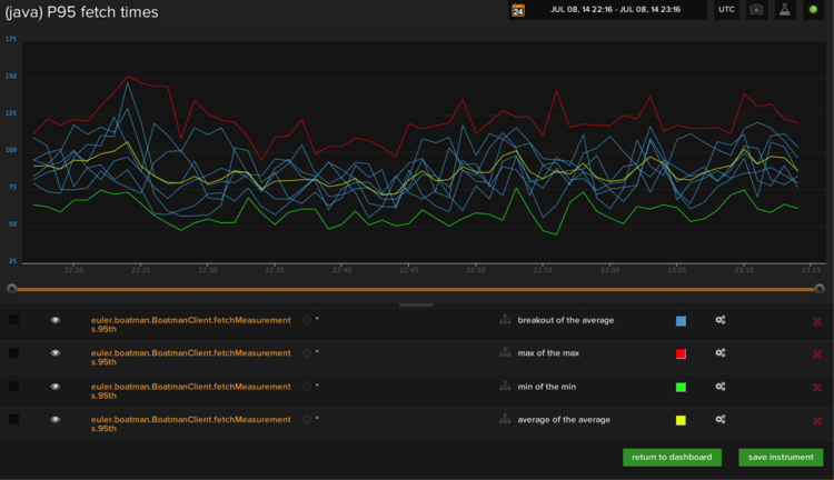
The first variable (X) in this setting selects how our platform consolidates the set across sources. Breakout means that we’ll draw a different line for each source, Max means we draw a single line that shows the source with the highest value in each period, and Average means we average all sources together.
The second half (Y), selects how we consolidate data points across time. This is analogous to the data consolidation function we’ve been talking about above. Any time we need to display consolidated data, we’ll use this setting to choose the consolidation method to display.
Our hope is more time-series systems will begin using complex data points to properly preserve time-series data from arithmetic mean corruption in the future.