
Note: This article was originally published on Librato, which has since been merged with SolarWinds®AppOptics™. Explore application performance monitoring using AppOptics.
I need to learn this. I get that feeling from time to time. Maybe you have experienced it too. For me, it happens when I know there is a better way to do things and I feel there isn’t enough time to stop and learn. It actually happened a few weeks ago.
We have a large codebase and our UI seemed a bit slow so we decided to take a peek and see if we could improve performance. In the past I relied on my intuition to reason about performance. I’d try out some changes and test again in the browser. If the change seemed to make things faster, hooray! However, intuition didn’t always work; I knew that if I wanted to make any improvements my old methods wouldn’t do. I would need to use some new tools. I did know about timeline in the Chrome DevTools, but only that it could tell you information about performance and memory. I never stuck with it long enough to actually understand what I was seeing.
After a few hours of working with the timeline profiler, things began to click. I saw performance improvements we could make: dead code we weren’t using and performance bottlenecks. I’d like to share a few “Aha!” moments I had along the way.
Navigating Chrome DevTools
First off, you have to know how to get around. I found it difficult to navigate the flame chart in the beginning, but then got a hold of it. Zoom in and out using the vertical scroll. Move left and right using the horizontal scroll. Often times, I wanted to take a screenshot of the timeline with a certain beginning and end that occupied the entire space. I was constantly zooming and moving to focus on a particular area. I discovered that if I zoomed in on the edge of a chart it would expand in the opposite direction.

Reading Flame Charts
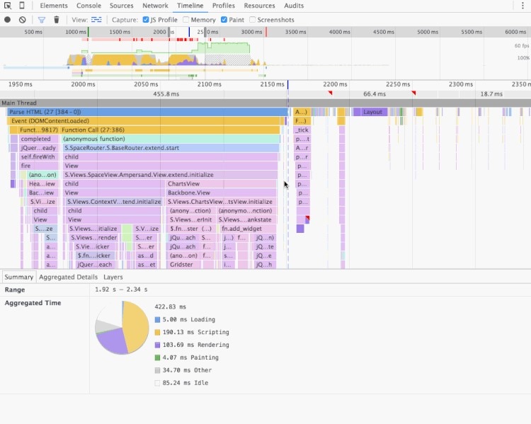
The flame chart view is an excellent source of information and insight into what our code is actually doing. It is a data visualization of your call stack while the timeline was recording. You can see which functions were called, how long they ran, what other functions they called, and so on.
Early on, I was able to spot several pieces of code we didn’t need during the page load just by examining the flame chart. Here is the call stack of our spaces application on page load. The router is kicking off everything we need to create the space view for the user.

You can see the EventsPanelView is initialized during startup. I’m fairly familiar with this section of code so I immediately knew the EventsPanelView isn’t used here and that we could remove it entirely.
Work to the Bottom
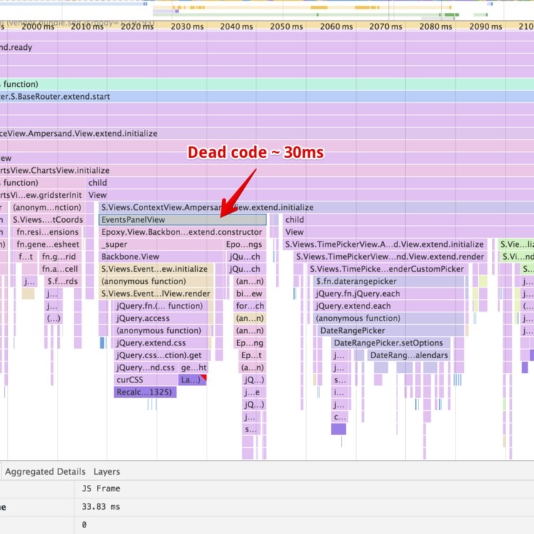
It is easy to lose sight of what is happening when you’re looking at flame charts. You can feel like you are constantly zooming, scrolling, and moving while the flame chart is crazy deep. One thing I learned is to understand the difference between self time and total time for a function call. It’s straightforward and I’m sure you can guess it, if you don’t already know. Total time is how long the event took, and self time is how long the event took without any of its children.
A tall and wide stack of events usually means that something towards the bottom is taking a long time to run. It may be difficult to see in the picture below, but we’re making a call to jQuery’s show method which calls several other methods and ends up doing something that causes the browser to recalculate the styles. The total time is large while the self time is actually zero for the events in the stack. By following the call to the bottom you can see that jQuery is causing the browser to recalculate styles.

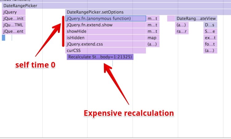
We can avoid this recalculation by rewriting the DateRangePicker.setOptions method to use something other than show.
Look for Patterns
Once you begin to look for those tall, wide event stacks, it is easy to spot patterns. In this example, you can see that we were running the same stylesheet calculation every time we render a chart to a space.

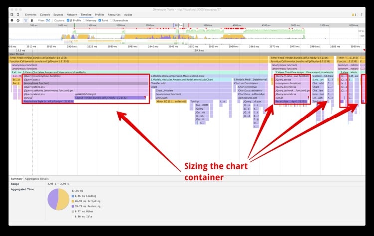
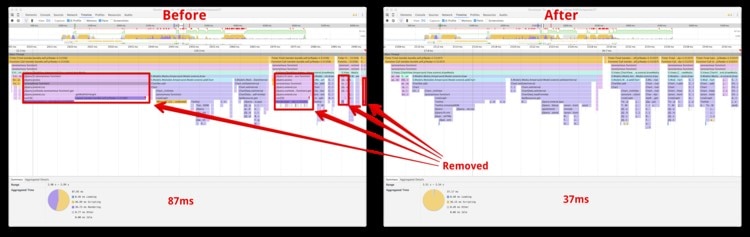
The fun begins when you refactor the slow code out and compare it with the new results. Again, in this case we reap some performance savings by replacing jQuery with native JavaScript. This particular method uses jQuery’s width and height to set the height of a container. Instead of using jQuery we can use the DOM properties .outerWidth and .outerHeight to set the size.

Woo hoo!
Follow the Red
One thing you may have already noticed are the red markings on the graph. These red markings appear during a drop in performance.

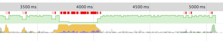
To make sense of these markings it is helpful to understand what they are actually measuring. If you zoom in closely enough to the flame chart, you’ll notice some distinct groupings appear. Here I have zoomed in to about a 140 milliseconds window and you can clearly see the timeline partitioned.

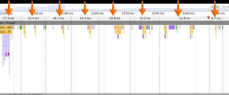
These groups are the animation frames rendered by the browser. You can think of an animation frame as the amount of time the browser takes to update itself. For the silky smooth performance we’ve heard so much about in web applications it is recommended that each animation frame runs in about 16 milliseconds, which comes out to 60 frames per second.
The red markings signal that the animation frame is exceeding the browser’s refresh rate and could be causing some visual lag in your UI. The obvious solution is to try and eliminate as much red as possible, but how do we do that? Well, one clue is in the flame chart view itself.

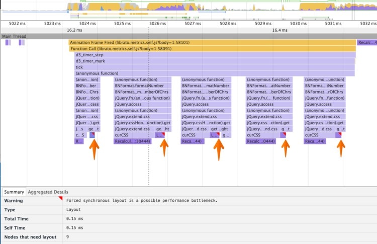
These red tick marks indicate that a forced synchronous layout, otherwise known as layout thrashing, occurs within a function. That means we’re reading from the DOM, then writing to the DOM, and then reading from the DOM once more, which forces the browser to recalculate the layout before proceeding. In these cases, I’ve found there isn’t a magic solution; you simply have to dive into the code and see what is happening.
For more information on layout thrashing, I recommend Google’s excellent article on diagnosing forced synchronous layouts.
Closing Thoughts
Learning new things is sometimes intimidating and the upfront cost in time can seem to unbalance the perceived benefit, while the perceived benefit from learning is often a fraction of its true value. By spending only a few hours learning a new tool I was able to immediately make quick and certain decisions which would have previously been guesswork. Every day since I see that it is helping me decide which on areas of our code base can most benefit from improvement.
If you are interested in learning more about the Chrome timeline tool, I found Google’s technical write-up How to Use the Timeline Tool to be a fantastic resource.